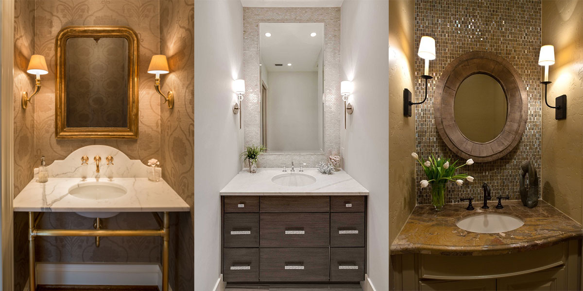
Vanity Sconces On Side Walls

These three lovely examples of half-bathroom vanity walls all have on thing in common; the wall sconces have been installed on the side walls. They are all still at about eye level, but 12″ from the corner, it cleans up the narrow wall on which the mirror is mounted and brings delicious light closer to your visage. The first example is by Archer & Buchanan Architecture Ldt., the second is by 41 West.

I would love to see an example of this in which a frameless mirror takes the entire remaining wall space (full width and full height above the vanity), this would allow the sconces themselves to be reflected, adding more light. A metallic grasscloth wallpaper would also highlight the side walls beautifully by carrying the light from the sconces along the reflective finish.

Share Button

Artifacts by Kohler

artifacts_kohler

The Artifacts faucet line by Kohler is a selective faucet line with much to select from. There are three handle choices, as well as three spouts in gorgeous traditional and industrial looks anyone could love. The spout designs are teapot, bell, and column, and the handles are available as prong, swing and lever. Here are my two favorites: Read more

Share Button

The Case Of The Well Lit Mirror

Electric MIrror Integrity built in light

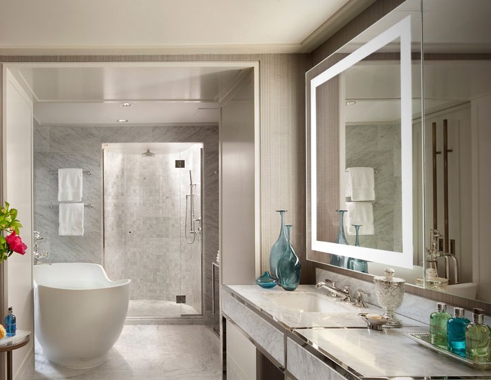
Lighting is everything. Functionality of a room, aesthetics, and appreciation for what goes into designing a room can all be lost if not for the case of well lighting. And these darling mirrors from Electric Mirror are a fantastic example of thoughtful design. A light placed above a mirror can cause your reflection to have an interrogation room feel, which is just great for first thing in the morning. Lights placed on wither side of a mirror cannot always be done if space will not allow for it, and that eats into the wall space you have allowed for a mirror. So build it in, have the light frame your face the way photographers use reflector panels to give proper exposure of light.

Read more

Share Button

Barely There Bath

Barely There Bath Laura Burton

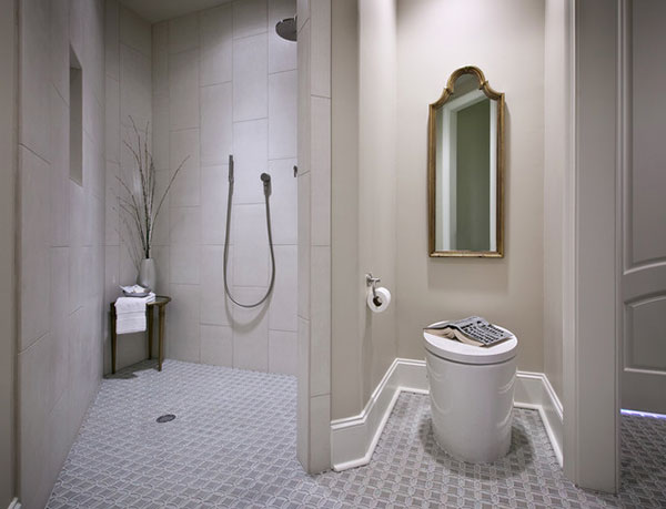
The simplicity of this bath design by Laura Burton is quite pretty and clean. The trick is to treat the bathroom like any other room in your home; choose a fantastic mirror, a large base molding, and fashionable glass topped table for setting various bath needs. The floor was selected in a tight pattern to anchor the room, much like a patterned carpet would. The Hatbox Purist toilet shown here may be discontinued by Kohler, but the new Numi is a similar design.

Share Button

Virage by Brizo

Virage faucet by Brizo

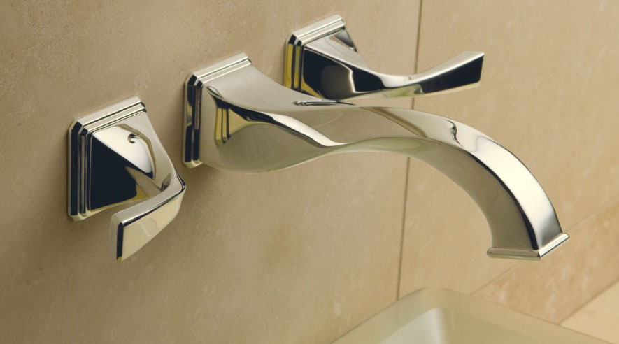
If you like polished chrome but want something unique for your bath, get the eye bending wall mount faucet by Brizo. The Virage family has a 90 degree spin that takes on a fluid and modern flare.

Share Button

Age In Place Bath

Moen Age in place bath

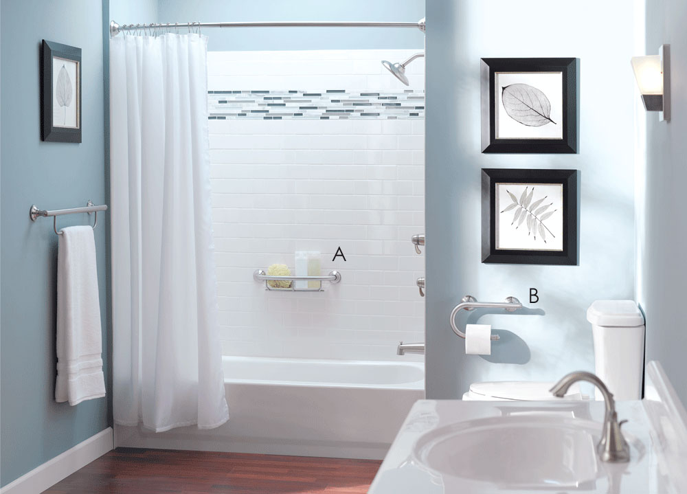
Aging in place for the older generation can be hazardous, particularly poorly planned bathrooms. With slick tiles, shower thresholds that are harder to step over, and lack of the necessary aids, it is no wonder The New York Times raises the thought that the bathroom is the most dangerous room in the home. It is very dangerous to use a generic towel bar or even door knob to steady oneself or gain leverage, and now the options to help are more readily available than every before. The new grabs bars for example, don’t look like the institutional styles that first come to mind. B in the image above is a grab bar and paper holder in one. Read more

Share Button

Mirror with Hidden Light

Diamando Mirror by Sidler with built in light

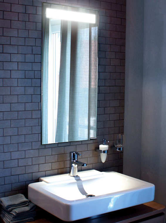
In a world of sleek and contemporary bathrooms, the Diamando mirror by Sidler fits right in with one key feature; a hidden integrated light. The Diamando don’t just look good, it works overtime as a recessed medicine cabinet as well.

Share Button

Serenity Bath by Aqautic

Aquatic Serenity 11 Freestanding Bath Tub Black and White Aquatic

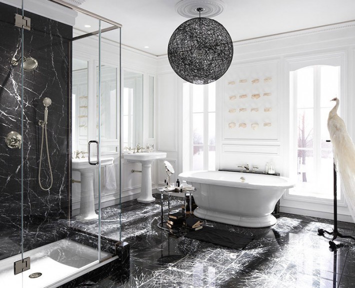
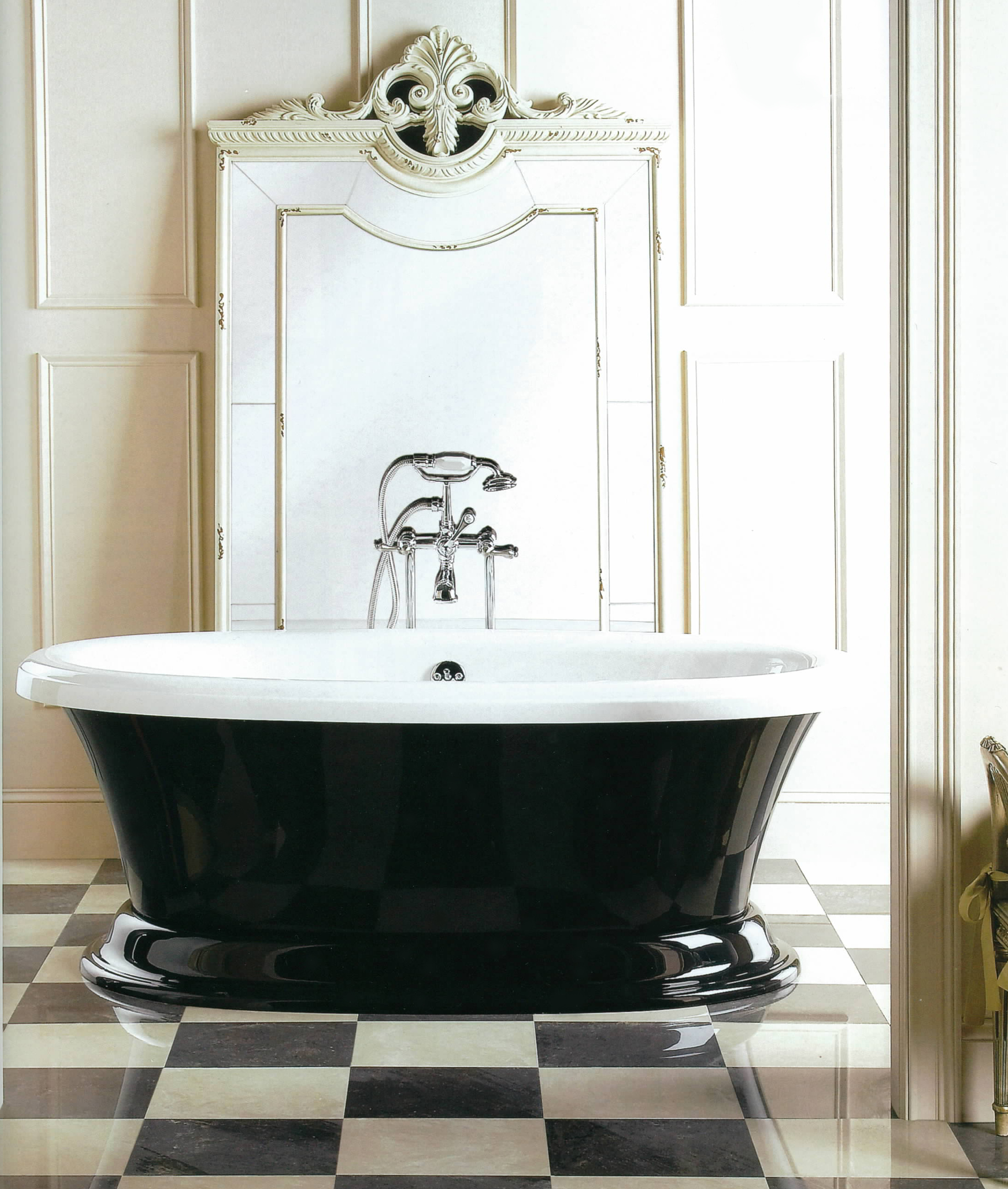
What is black and white and oh so nice? This freestanding bath tub by Aquatic! The Serenity 11 is available in many different colour combinations, and as an air bath as well. It is stunning in black and white, especially here combined with a venetian mirror leaning on an off-white painted and panelled wall, and black and white marbled floors.

Share Button

Get This Look: Earthy Powder Room

Solid Rock Vanity in Colorado, get this look

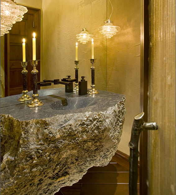
The outdoor scenery surrounding this powder room in Beaver Creek, Colorado is the catalyst for the rustic yet refined design by Billy Beson. Bringing the elements of earth into this space feels so natural, just look at the fantastically textured vanity stone basin with polished top, organically shaped quarts light pendants, twig shaped door handle, and plastered and warm honey-colored walls. Can you get this look? Absolutely.

Read more

Share Button

Mirrored Mosaic Tiles

Royalton Hotel New York Alcove Suite Mirrored Tile Tub

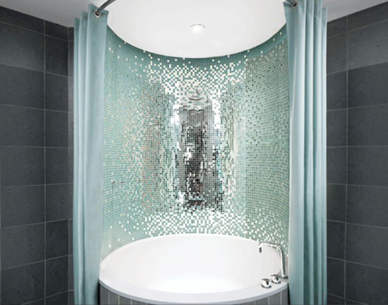
Nothing compares to the reflection of natural light and the purity and serenity it implies. That is certainly the case in the Alcove Suite at the Royalton Hotel in New York. Designed by Philippe Starck, the tub surround is studded with mirrored tiles. It is just magical. A monochromatic scheme or very neutral palette works best when using a lot of mirror, otherwise, you may get a look that is way too busy.

Read more

Share Button