Harmonious Alignment
What do get when your architect, electrician and cabinet designer have an amazing working relationship? -Harmonious alignment. Let’s take a look of a few examples:
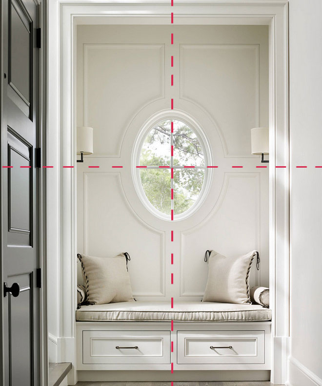
The image above is a foyer by Beth Webb Interiors. The window is the obvious focal point, centered in this space, it creates a perfect pivot point. The window mullions divide the wall into four quadrants, the panel moulding emanates from it. The horizontal line is further emphasized by the sconces on either side as they are mounted at the same height as the divide. There are two bench drawers, reflecting the panels above. Just looking at this foyer gives you a zen vibe, which makes it the perfect resting spot.
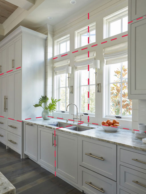
In this kitchen by Geoff Chick & Associates the central line is a vertical one that lines up the middle window mullion with the faucet and sink cabinet. The break between the top transom windows and the set of windows below line up horizontally with the stacked cabinet doors over the pantry cabinets. And subtly you can see the top of the drawers on the pantry line up with the countertop, and the countertop lines up perfectly with the bottom of the window trim. On a side note, I love the placement of the light sconces, imagine them on at night with the roman shades pulled down.
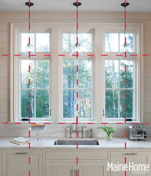
This kitchen featured in Maine Home & Design also has three windows, but here they are punctuated with the placement of three pendant lights. Notice how the bottom of the lights have been hung to the same level as the break between the sets of the top transom and bottom windows. The backsplash slab was cut higher than typical so it would reach the bottom of the window sill.
Thoughtful placement of each element is all that is required to achieve any of these looks. So treat your tradespeople nicely and remember how they like their coffee, because darlings, it’s all in the follow through.


Leave a Reply