Harmonious Alignment

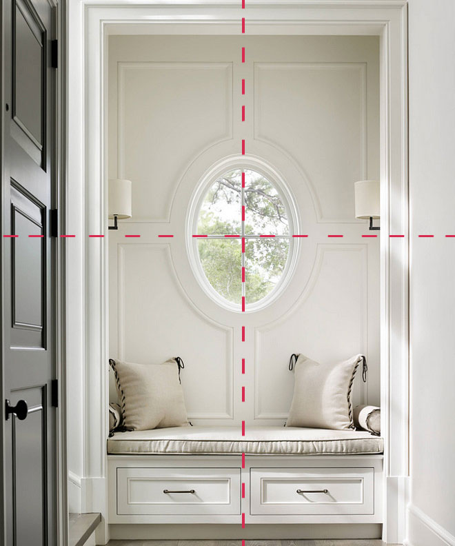
What do get when your architect, electrician and cabinet designer have an amazing working relationship? -Harmonious alignment. Let’s take a look of a few examples:

The image above is a foyer by Beth Webb Interiors. The window is the obvious focal point, centered in this space, it creates a perfect pivot point. The window mullions divide the wall into four quadrants, the panel moulding emanates from it. The horizontal line is further emphasized by the sconces on either side as they are mounted at the same height as the divide. There are two bench drawers, reflecting the panels above. Just looking at this foyer gives you a zen vibe, which makes it the perfect resting spot. Read more

Share Button

Fête Themed Girl’s Bedroom

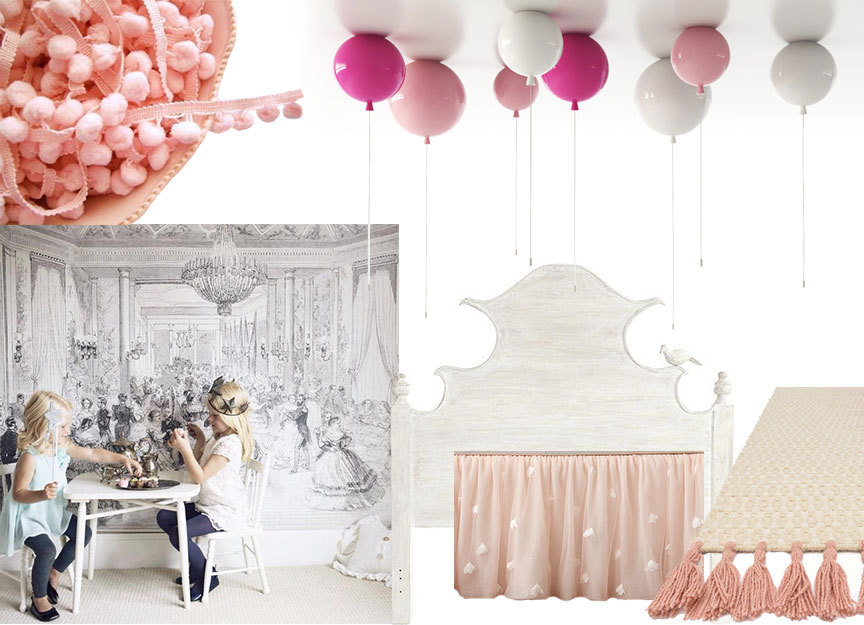
Your little girl never has to leave the tea party early with a room this pretty and fun! The best part is the balloon ceiling lights by Boris Klimek. The strings also serve as the light switch!

Get this look: (top left to bottom right) Read more

Share Button

Precious Stones in Design

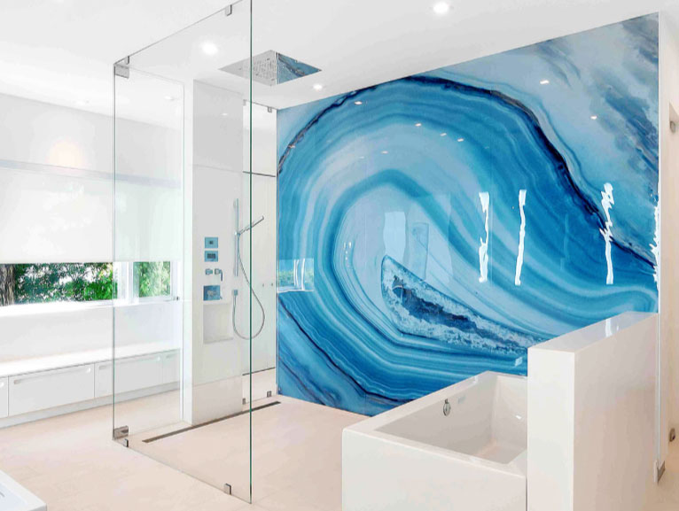
If you haven’t the budget for true precious mineral slabs in your next design, perhaps this might be just the ticket; Alex Turco‘s visions are alive in beautiful decorative art panels that have limitless possibilities as they are malleable and can be placed in any installation.

The “Blue Agate” panel from his Minerals Collection is on a plexiglass surface, making it a great choice for this application as a shower wall. I love how the mineral form almost mimics an ocean wave. Read more

Share Button

Designing with Bold Murals

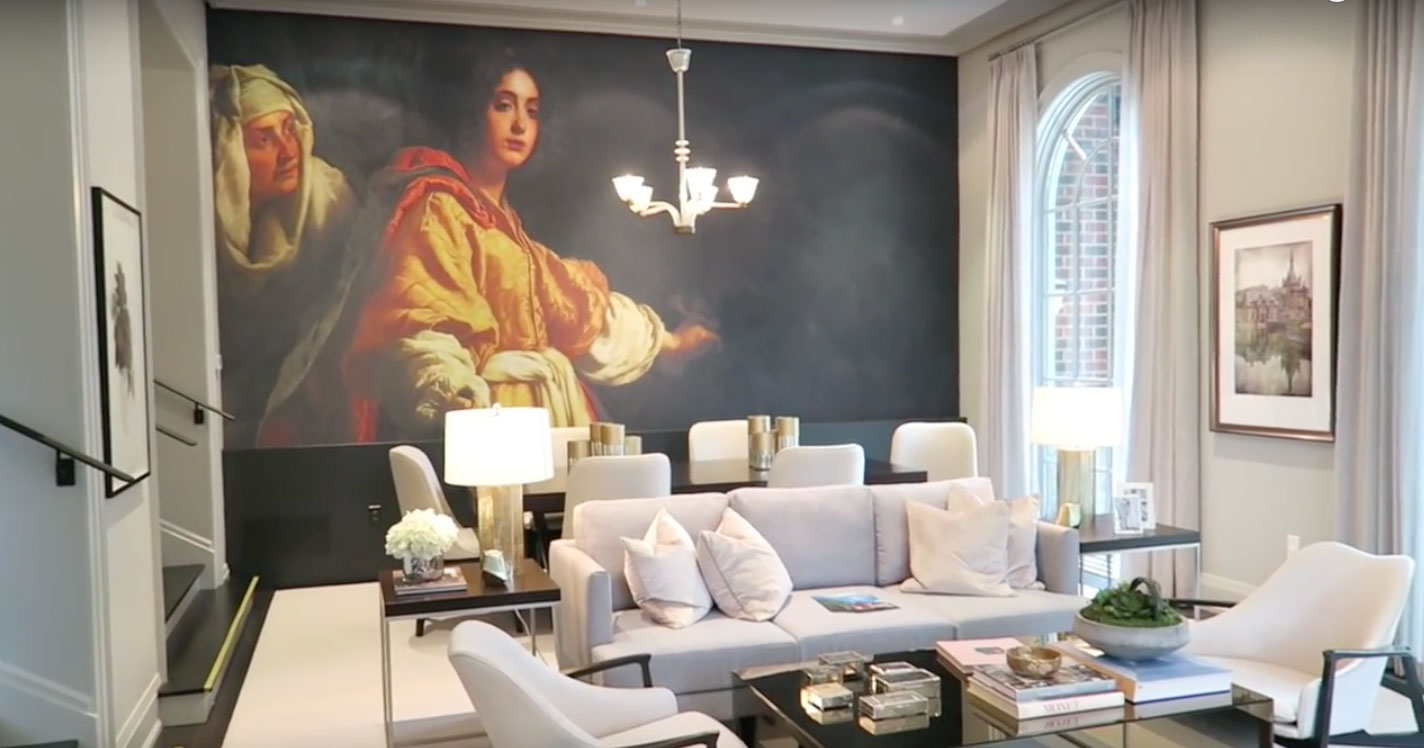
In 2015 Brian Gluckstein spearheaded the design for the Princess Margaret Showhome, and my favorite part was the large mural in the dining room that took up nearly the whole wall. It was a custom print made from a classic oil painting. Read more

Share Button

Chef’s Table

Have you ever made a reservation for a chef’s table at a restaurant? A chef’s table is a special table only available in some eatery’s that are located near or in the kitchen itself. It can be a thrilling and intimate dinning experience for the foodie in you. Many residential kitchen designs have this already; a dine-in kitchen with a corner banquette, or bistro table thoughtfully placed for the chef and one or a few other lucky ones.

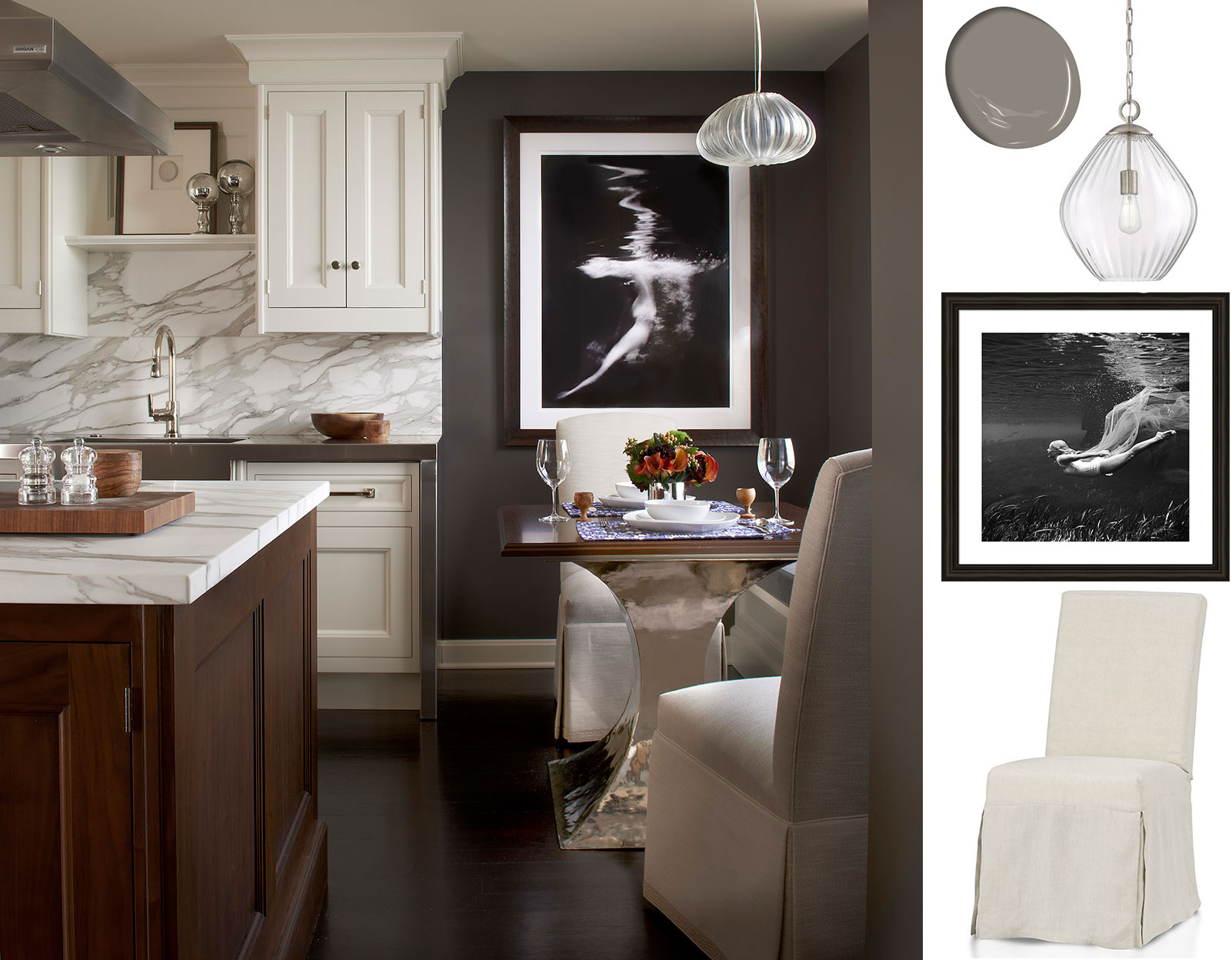
The image above is a kitchen design by Frank Ponterio. See the use of a seductively darker paint colour to envelope the small dining area just steps away from the kitchen cabinets. The slipcovered linen chairs are brilliant, not only do they give an inviting feeling of plush furniture, but the slipcovers can be removed for easy cleaning. A great piece of art and pendant light fixture anchor the table to its designated spot. Read more

Share Button

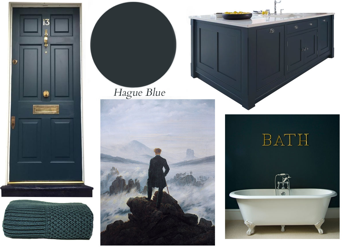
Color Study: Hague Blue

The only blues I am feeling this cold January is this gorgeously grounding deep shade; Hague blue (pronounced h-AI-g).

How to use Hague blue: Read more

Share Button

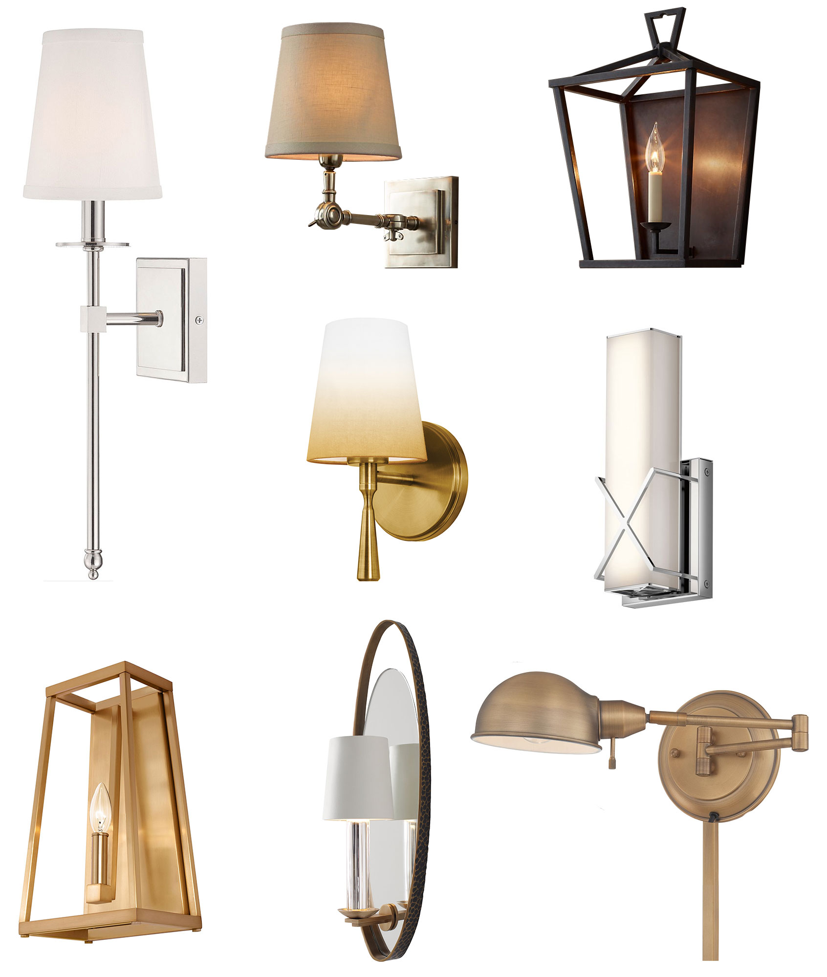
2017 Wall Sconce Picks

Wall sconces are one of the best ways to add incredible visual impact to a room. Installed at eye level, they invite and welcome better than any other lighting source. Here are my top picks for 2017.


From top left to bottom right: Read more

Share Button

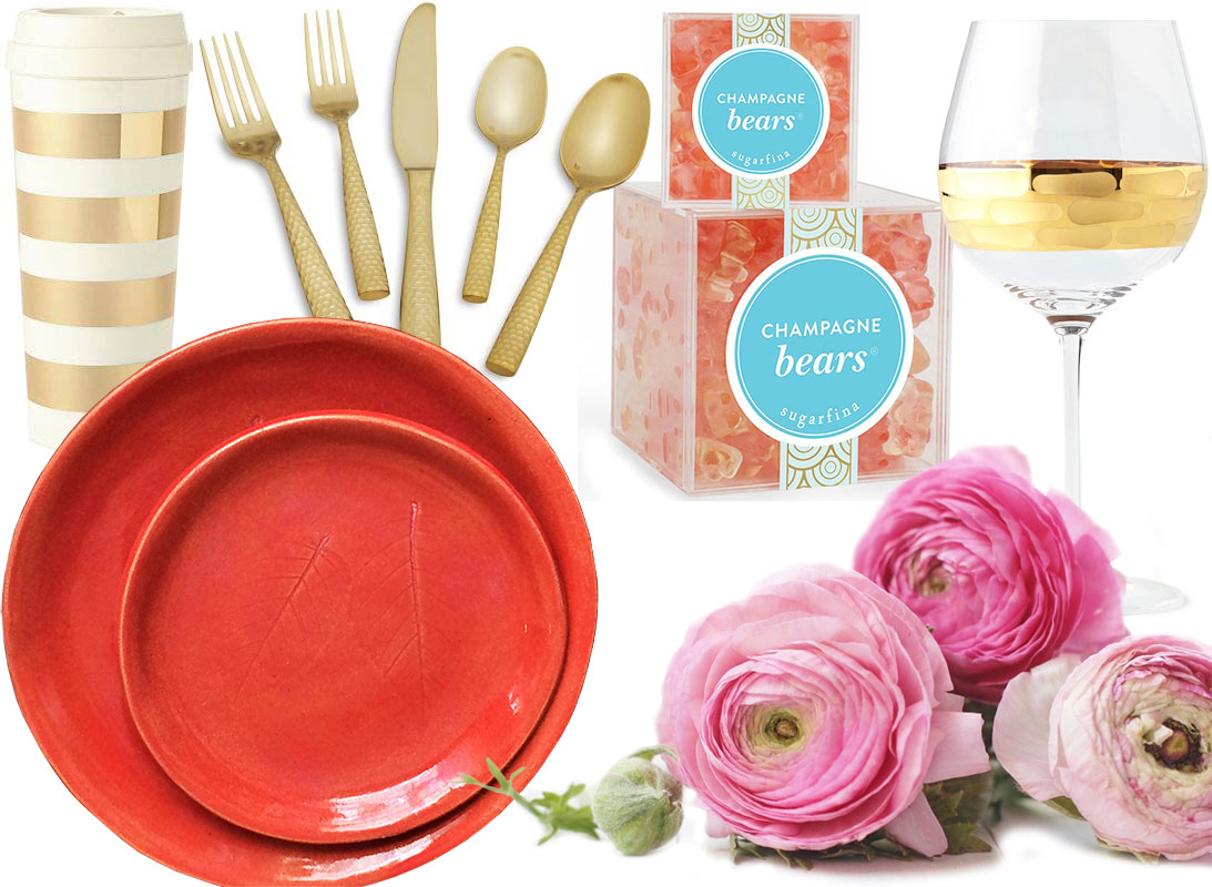
An Evening With Your Valentine

Sometimes Adam and I like to go out for Valentines the day before or after the 14th so we miss the packed out restaurants and parking lots. We still make Valentines day a special occasion as an extra special dinner is planned for enjoyment at home. The bonus is that you get two days to celebrate! Here is what your evening could look like chez moi:

From top left to bottom right:

Read more

Share Button